.png)
POM was a case study conducted as a part of Design@UCI's Project Team challenge. Our team's goal was to have fun with this case study, and expanding the borders of what we usually do. Additionally, we wanted to make a product that we would be happy presenting, and that we could envision helping fellow college students.
The team I was working with was fairly new to UI/UX Design and the processes that come with creating a case study. I, too, had only done a few class projects beforehand. In order to get our team rolling, I suggested that we start with a low-stress brainstorming session. I brought in some questions of my favorite questions that we could talk about in an open-forum. Things like "What is your favorite website to use?" and "What is one problem in your life that seems small?".
By doing this process, we ended up discovering that we were all tired of online-learning and COVID-19. Specifically, having to navigate studying. This case study was being done towards the end of a completely remote school year, which further emphasizes our frustrations. Additionally, we hated having to have multiple tabs and desktop apps open at once just to have a productive study session.
Why this idea?: We decided on sticking with this idea because we're students too! And we understand that virtual learning and studying are hard, so we wanted to create something fun that encourages people to take a break. This is how we came up with our idea, POM.
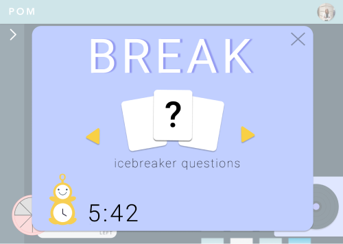
What does POM do?: POM is an application that uses the Pomodoro timer technique for studying (study + short breaks), allows users to connect with a study buddy (another user, pre-recorded video, animated pal), utilizes features such as built in reward system, to do list/calendar, shared music playlists, with breaks that consist of mini icebreaker questions.
Now that our group had a solid idea of what we wanted to create, we started to embark on the user research phase. We completed competitive analyses, user surveys, and personas. Our group also identified our target user base of 18-22 year old college students to help us structure our research.
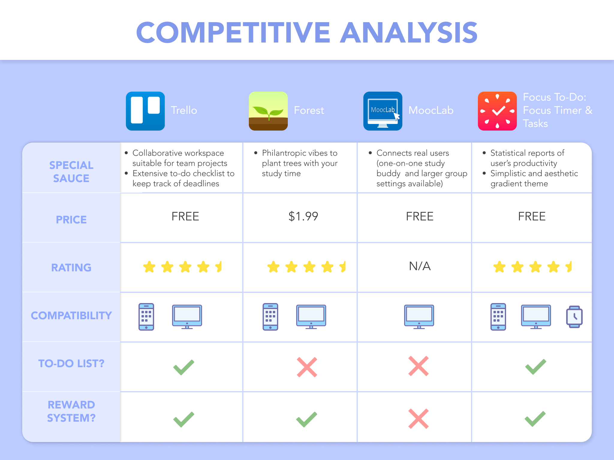
To complete our competitive analyses, our group began researching studying-related applications and websites. We also looked at our own favorite apps. One of our members, Celine Ross, took the lead on this portion and narrowed down five applications that had a similar offering that we wanted ours to have. Below is her Competitive Analysis table where you can see the different features and "special sauce" they offered. This really helped us refine what we wanted to offer to our users.
Our next step was to conduct user surveys. I had a lot of previous experience with creating surveys from previous projects/involvements, so I took the lead in this portion. One of the best things about user surveys is that we get to hear from real people (and potential users!). This is why asking the right questions and making the survey accessible was a priority for me. I led a brainstorming session with my group where we talked about what information we wanted to gather, and then created a Google Form. We sent out our survey to our friends and classmates, and ended up with 37 responses in one week.
We asked questions specifically about the Pomodoro technique, which was a key idea POM was created around. Below is a pie chart representation about our responses. A surprisingly large number of people have heard of the Pomodoro technique, but a lot of them do not actually use it to study. With this result, we knew that we had the opportunity to create an application that closes this gap.
Our survey also asked questions about people's study habits (e.g. study session frequency, length, solo vs group), what helps them focus, what distracts them, and any existing apps they use to help them study. The 37 responses to these questions allowed our group to tweak the features of POM and aided in the design of the site.
Our last step in our user research phase was to create personas. I created these personas along with another group member. Together, we used the data collected from our survey to identify two potential users of POM (shown below). These personas gave us a quick snapshot of a user to refer back to.
.png)
.png)
The design section of our case study started at the fourth week of our case study overall. Our team now had a stronger vision of what we wanted POM to become and had a good amount of user research completed. We knew that this section might take a long time, especially because some of our group members were new to this process. We wanted to be mindful of the learning curves from using Figma, so we made sure to have joint design sessions on Discord whenever possible. I also did my best to help led this process by sharing my design thought process and past experiences.
For our first step of the design process, our team completed sketches. Each member drew up what they envisioned what then they thought of POM. These sketches can be seen below. Our members had sketches that included video screens, to-do lists, split screens, and chat boxes. We discussed each sketch to narrow down what visuals we wanted to move forward with in the design process. We also continually revisited our user research and ideal functionality to see what features were feasible for us to implement and iterate. In the end, we had a stronger picture of POM to work with.
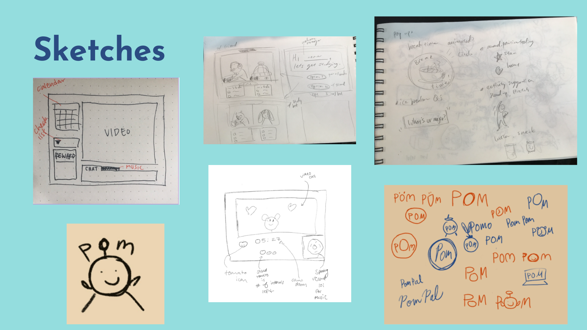
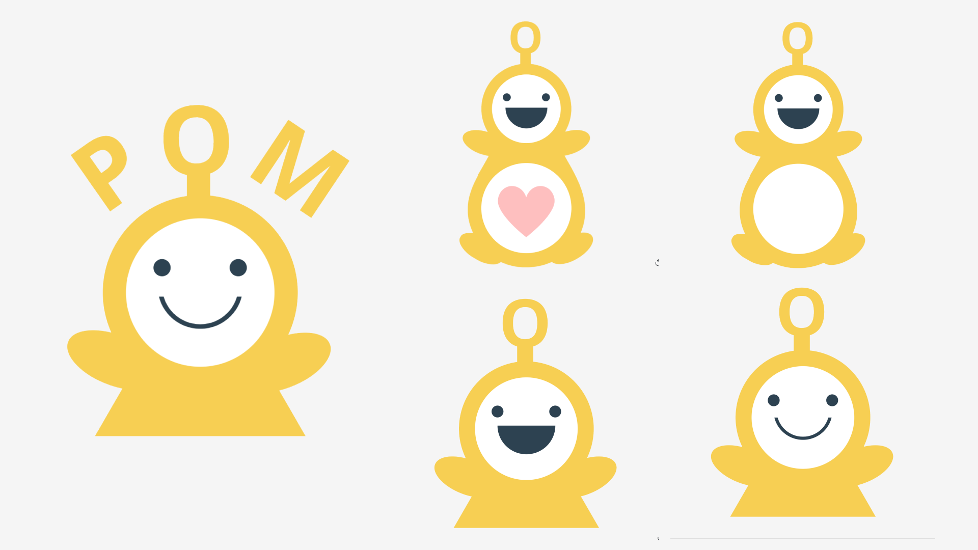
In the section above, you may notice a cute little character drawing that appears throughout the sketches. That is our wonderful POM pal! As mentioned earlier in the case study, our team wanted to focus on making the application fun to use. One of the ideas we played around with was having a cute interactive animation that you could video call to "study" with. It's a way to feel like you have a study pal to keep you accountable, even if your friends are busy. Our team member, Reiko Inoue, was super skilled in art and she came up with the design for our POM Pal. The entire team became instant fans of this design and decided to utilize him in our application. Below are a few different variations of him that we used throughout the designs.
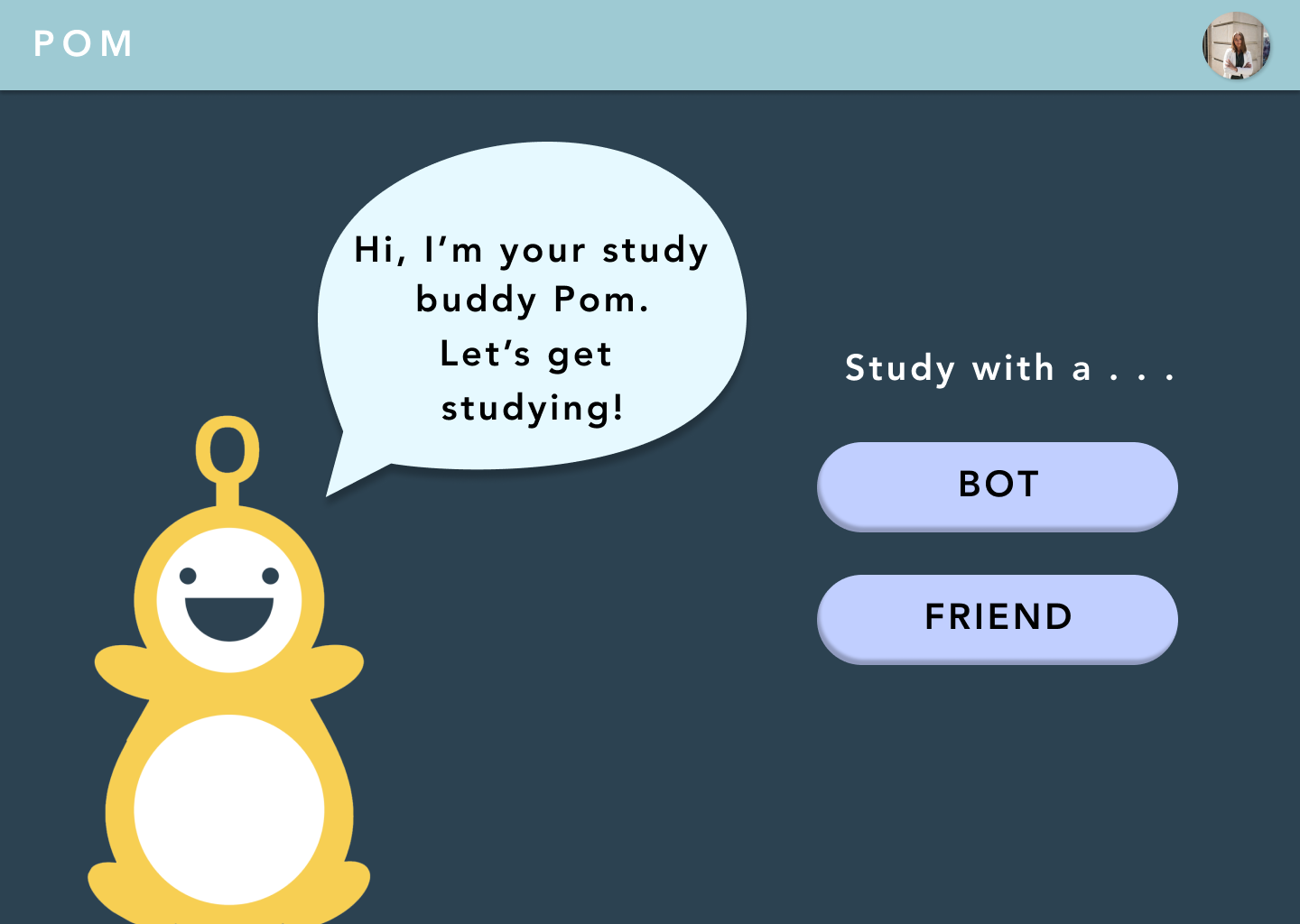
With our sketches complete (and our lovely POM pal by our side), our group moved onto creating low fidelity mockups. These intial designs focused on the general layout of the components/features we wanted. Below is a slide show of a few of the ones our team came up with (my design is the last in the slide show). Something that our group noticed after completing these was that they each highlighted the video portion of the page. It took up a larger portion of the page, with the other features surrounding it in little compartments. We liked this general idea and decided to keep it as we began iterating towards our final mockups.
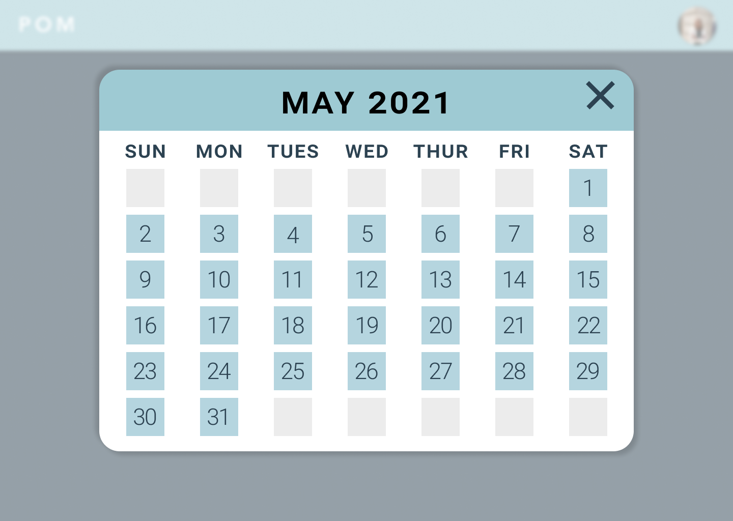
The next phase our team worked on was creating the final high-fidelity mockups for POM. To do this, we split up the design of certain pages. For example, one of us would be working on the welcome page while someone else was working on the calendar popup page. Our designs were kept consistent with one another by following a style guide we created earlier in the case study. It included the system's colors and fonts. Below is a few of the final mockups we ended up creating together. I personally worked on the 3rd, 4th, and 6th pages (counting from left to right, up to down). Additionally, I designed the small record player component pictured in the lower right portion of the 2nd photo.

.png)
.png)
With our final mockups complete, it was great to look back and see what parts of our initial ideas stayed all the way until the end. Our final designs definitely matched up with what we wanted POM to be. Our group really enjoyed that we did not shy away from color or "playful" elements. We didn't want our system to feel cold or like the sites we were already using for school. Our final mockups show that we leaned into the cute POM pal and calming colors.
For our team being new to design and the entire process, we were incredibly proud to have produced these high fidelity designs.
For the final part of our case study, we created a prototype for POM using Figma's interactive prototyping feature. I had previous prototyping experience so I volunteered to lead this part as well. Below is a walkthrough of POM's key features, where I also narrate the different user flows!