Aqua was a quarter long design project for one of my upper-division Informatics classes at UC Irvine. I was working with a lovely group of fellow classmates, whose names and roles are listed below. The main tool I utilized for this project was Figma. Our team's journey and my contributions are listed on this page!
With our idea for Aqua solidified, my team and I began doing user research. We conducted a Comparative Analysis, utilized Surveys, and created Personas. I worked on the Comparative Analysis by formatting the sheet, as well as researching competitor applications. For the surveys, I took the initiative of creating and formatting the Google Forms survey. I also pubbed it out to fellow classmates.
The first step we decided to do was to conduct a comparative analysis. It was important to know what we were up against when creating Aqua. I researched a few apps, specifically on Android and other non iOS systems. I chose that area mainly because of my previous experience with Androids. I was then able to report back my findings to my team, and we consolidated it into a Google Sheet. I created this table to emphasize how Aqua will have all of the traits we were looking for in competitor apps.
.gif)
Our next step was to conduct user surveys. I have a lot of experience with Google Forms and so I recommended using this method. I also created the skeleton of the form and helped handle any logistical tweaks (i.e. formatting, sharing permissions)/ We then all came up with questions. Our findings showed that over half of our responders did not think that they drink enough water. Additionally, around 90% of folks indicated that the water they drank daily was less than 8 cups. These statistics helped support the need for Aqua. Our potential users currently did not drink enough water, and did not make it to the benchmark recommendation of 8 cups.
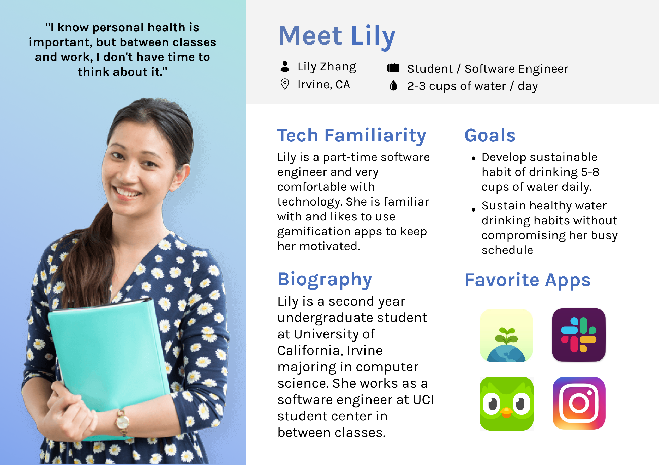
Our last step in Research was to create personas. Using the data collected from our survey, two of our teammates (Alexandria and Isabel) worked to make the Personas. The rest of us, me included, focused on sketches (see next section). The personas helped our team remember who the app was for as we went through the rest of the design process. They provided us with a quick overview of our potential users, and what they needed from a system like Aqua.
.png)
After the completion of research for potential users and target audience, we moved onto the sketching process. This section is where I really honed in on. My main goal was to sketch designs for a "Water History" page and a "Home Screen". Using my knowledge from other wellness gamification apps and the information from our research, I got my trusty paper and pencil and began to sketch. My sketches can be seen below.
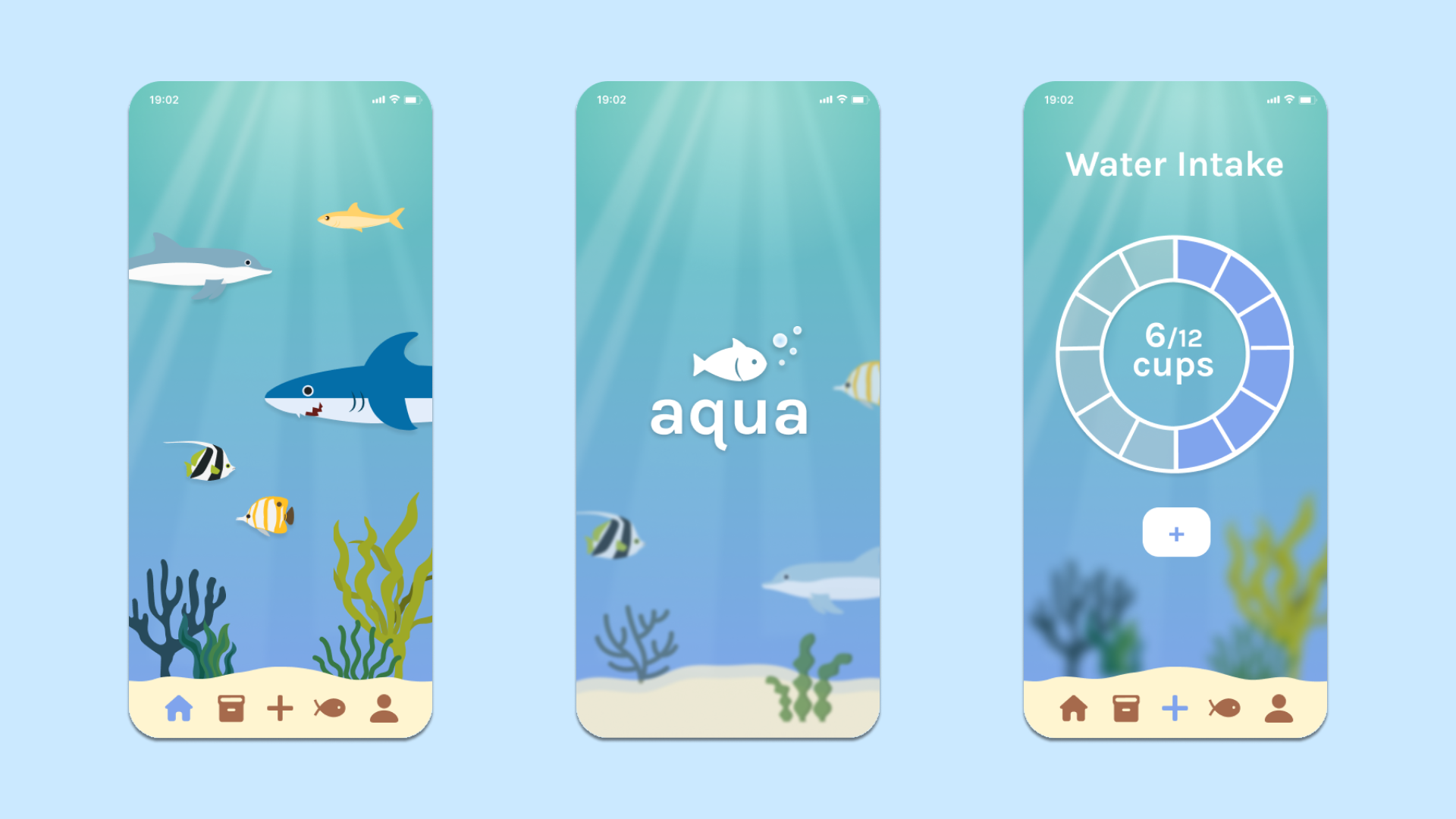
For the "Home Screen", I really wanted to accentuate the idea of being in the ocean. I chose to sketch out a reef-like area, where aquatic animals would be seen on the upper portion of the screen. Additionally, I added a health bar and coin count at the upper right, because that is the first thing I think of when I think "gamification".
The first thing I pictured when doing the "Water History" was a screentime-esque bar chart. I sketched out a bar for every day of any given week. The thing I had trouble with was the statistics portion. I wanted to give users a snapshot of their time on Aqua. I sketched out a simple text-focused stats section (far right polaroid) and an icon based one (middle polaroid).
.png)
After sharing our sketches with one another, our group then moved onto creating mockups. We used Figma for this. Based on my sketches, I focused on the "Water History Page". I created a few different versions of the bar chart, utilizing different colors and data mapping. Below is a few of our first mockups for our app that did not make it into the final prototype. These mockups showcase our iterative design process, and how there were so many different options we could choose from. We ended up creating over 20 frames of screens throughout our project.
.png)
The screens above are a few examples of different mockups from my teammates and I. One thing to note is the evolution of my Water History design page in the bottom row. The bar chart idea I had ended up sticking throughout iterations. Although colors and styles varied, the heart of it was still there. The navigation bar at the bottom also evolved throughout our time. I first created the sand-shaped bottom in an attempt to present the stats on the page, sort of like a piece of treasure at the bottom of the ocean. My teammates liked the idea, and then upgraded it to a navigation bar that proved to be an essential piece to Aqua. We constantly tweaked small things, and had long discussions about our app. Together we chose our final screens and finished the last iteration of Aqua mockups.
As the quarter came to a close, we decided to finalize our mockups and began to create the prototype. Our final version included the following pages: Home Screen (Reef), Fish Book, Inventory, Water Intake, Profile, and Settings. An example of Aqua is linked below, where I am clicking through the interactive prototype to show the different pages.
With the quarter over, my time with Aqua came to a close. This was the first big design project I have ever done, especially with a group, and I have learned mountains of valuable information! I became a Figma-whiz, for starters. I used to be a novice but I am now more comfortable with it. Additionally, I learned that every step of the design process is vital for success. Every step was done with care and passion, and in the end, Aqua became a meaningful application.
Although a lot of the mockup and prototype building requires tedious tweaking and meticulous management, it is essential to always remember the big picture! There were often times where I myself had big picture ideas, but was not too sure how to carry them out. By sharing my ideas with the group, it then sparked them to add on to them and create concrete ideas together.
It is no secret that design is by far a linear process. Aqua taught me that there will be points in time where you feel like you are at the final version, but then new information comes in that makes you reevaluate your design. Go back and change it! It is never too late to reassess the system, especially when you have then chance to create a better design for folks!